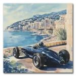
The science behind color in canvas art reveals its remarkable ability to influence your mood and emotions. Different hues trigger specific psychological responses; for instance, warm colors like red and orange ignite excitement and energy, while cool tones such as blue and green invite tranquility and relaxation. Notably, cultural contexts can shift how you interpret colors; yellow might evoke cheerfulness in one culture and anxiety in another. Artists have long employed these principles, crafting works that resonate on deeper emotional levels. So, as you explore the world of color in art, you'll uncover fascinating insights that go beyond mere aesthetics.
Understanding Color Psychology

Color psychology frequently explores how different hues can shape your emotions and perceptions. When you look at color canvas art, you mightn't realize that your mood can be subtly influenced by the colors used.
Warm colors, like red and orange, tend to evoke feelings of excitement and energy, almost like a double shot of espresso for your brain, while cool colors, such as blue and green, can wrap around you like a cozy blanket, promoting calmness and relaxation.
Choosing the Perfect Canvas Art can enhance these emotional responses by aligning art with your existing décor and personal preferences.
Research shows that these colors can even elicit measurable physiological responses. For example, red might get your heart racing, while blue could lower your blood pressure. Now, isn't that fascinating?
But remember, cultural contexts add another layer to your emotional journey with colors. Yellow might bring a smile to your face in the U.S., but in France, it could stir up feelings of jealousy, making it essential to be aware of these nuances when selecting mood wall art.
Artists like Picasso and Monet understood this interplay well. Picasso's Blue Period, for instance, masterfully used cool tones to convey melancholy, while Monet's lush greens brought tranquility to life.
By tapping into the psychological effects of colors, you can enhance your own artistic expression, whether you're creating abstract canvas art or simply choosing pieces for your home.
Ultimately, understanding color psychology allows you to engage more deeply with art, transforming how you perceive and interact with your surroundings.
Psychological Effects of Colors

Different hues can evoke distinct psychological effects that greatly impact your emotions. When you encounter warm colors like red and orange, you might feel an exhilarating rush of energy, almost as if you've just chugged a double espresso. This is no accident; research shows that red can increase your heart rate and create a sense of urgency, which is why it's often favored in marketing to stimulate appetite and action.
On the other hand, when you gaze at cool colors such as blue and green, a wave of calmness might wash over you, akin to the serenity of a peaceful lake. These colors tend to promote relaxation and can even evoke feelings of trust and dependability—hence their popularity in corporate branding.
Then there's yellow, a cheerful hue that can stimulate your mental activity and uplift your mood. However, be cautious; too much yellow can lead to feelings of anxiety, turning a bright day into a rather jittery one.
It's fascinating to realize that the emotional impact of colors can differ remarkably across cultures. For example, while you might associate white with purity and peace, in some Eastern cultures, it carries a connotation of mourning.
Emotional Impact of Specific Colors

Emotions play a significant role in how you perceive art, and specific colors can stir distinct feelings within you. For instance, when you encounter the color red, you might feel a surge of passion or excitement, as this vibrant hue often increases your heart rate, creating a sense of urgency that can be both exhilarating and overwhelming. It's like someone's shouting "Look at me!" in a crowded room.
In contrast, blue wraps you in a calming embrace, promoting feelings of trust and tranquility. Artists often use blue to craft serene atmospheres, as it's the perfect color for those moments when you just need to breathe and relax.
Then there's yellow, which, while it can brighten your day and spark joy, can also tiptoe into the territory of anxiety when overused—think of it as the overly enthusiastic friend whose energy can sometimes feel a bit much.
Green, reminiscent of nature, offers a soothing experience that enhances relaxation, making it a favored choice for artists seeking to instill a sense of balance in their work.
Finally, purple, a delightful mix of stability and energy, evokes feelings of introspection and creativity, often inviting you to ponder deeper thoughts while basking in its luxurious aura.
Each color, with its unique emotional signature, invites you to explore your feelings and reactions, turning every canvas into a vivid conversation about your inner world.
Color Psychology in Art

Art's ability to influence your mood hinges greatly on color psychology, where hues are carefully chosen to evoke specific feelings. You might not realize it, but those vibrant reds and calming blues you see in art can profoundly alter your emotional landscape. For instance, warm colors like red and orange can spark excitement or even aggression, while cool shades like blue and green foster tranquility and calmness.
Artists, aware of this psychological impact, often select color palettes to elicit particular emotional responses. Take Edvard Munch's "The Scream," where the fiery red conveys anxiety, or Claude Monet's lush greens that reflect serenity. It's fascinating how colors can also affect cognitive performance; research suggests that exposure to blue tones lowers heart rates and enhances feelings of trust and relaxation.
However, it's important to remember that cultural interpretations of color vary widely—yellow might signify cheerfulness in Western societies but can represent jealousy in others. This illustrates the importance of context in understanding color's emotional impact in art.
To clarify how different colors evoke distinct feelings, consider the following table:
| Color | Emotional Response |
|---|---|
| Red | Excitement, Aggression |
| Blue | Calmness, Trust |
| Green | Serenity, Natural Beauty |
Color in Branding and Marketing

Color plays an essential role in branding and marketing, shaping consumer perceptions and influencing purchasing decisions. Believe it or not, studies suggest that up to 90% of snap judgments about products depend on color alone, making it a game-changer in how you connect with your audience.
For instance, if you're trying to sell a product quickly, red can create a sense of urgency that might just push someone to click "buy." On the other hand, blue is often the go-to for financial institutions because it exudes trustworthiness—think of it as a financial hug.
What's more, the importance of consistency in color usage can't be overstated; research indicates that it can boost brand recognition by up to 80%. Imagine a world where your brand is instantly recognizable just because of its colors—now that's a dream!
However, tread carefully with yellow; while it radiates cheerfulness and optimism, overusing it can make your audience feel a tad anxious, like a kid who's had too much candy.
Color in Interior Design

When you step into a room, the colors surrounding you instantly shape your experience and mood. This isn't mere coincidence; it's the science of color psychology at work in interior design. Each hue brings its own unique energy to a space, influencing how you feel and interact within it.
For example, blue hues are often associated with calmness, making them perfect for bedrooms where relaxation is essential. On the flip side, warm colors like red and orange can energize a room, encouraging lively conversations—ideal for living rooms and dining areas. Green, with its connection to nature, fosters tranquility and balance, making it a popular choice for home offices where concentration is key. Meanwhile, neutral tones such as beige and gray serve as versatile backdrops, enhancing brightness and creating an illusion of spaciousness, particularly in smaller rooms.
To illustrate these concepts further, consider the following table:
| Color | Mood Effect | Ideal Spaces |
|---|---|---|
| Blue | Calming, reduces stress | Bedrooms, relaxation areas |
| Red/Orange | Energizing, stimulates conversation | Living rooms, dining rooms |
| Green | Promotes balance and tranquility | Home offices, study areas |
| Neutral | Versatile, spacious | Small rooms, flexible spaces |
Cultural Influences on Color Perception

Our experiences with color aren't just shaped by personal preferences; they're deeply influenced by cultural backgrounds.
Take yellow, for instance—while it brightens your day with cheerfulness in the United States, in France, it might just make you feel a twinge of jealousy. It's fascinating how one color can evoke entirely different emotions depending on where you are.
Similarly, the color white, often seen as a symbol of purity and innocence in many Western cultures, takes on a more somber tone in several Asian cultures, where it's linked to mourning and death.
Then there's blue, a hue that conveys trust and authority in the West, yet can represent immortality and healing in India. Isn't it curious how the same shade can wear so many hats?
Green, too, is a mixed bag; while it's widely recognized as a symbol of nature and tranquility, it can also signify jealousy or inexperience in specific contexts—talk about a color with an identity crisis!
Historical context adds another layer to this colorful puzzle.
Purple, long associated with royalty and prestige, commands attention due to its historical rarity and expense in dye production.
So, as you stroll through an art gallery, remember that the colors on the canvas may carry meanings that differ vastly from what you might instinctively feel, influenced by the cultural mosaic we all navigate.
Next time you admire a piece of art, consider the multitude of interpretations it may evoke based on the viewer's background. Isn't that a colorful thought?
Practical Applications of Color Psychology

When you think about color in canvas art, it's fascinating how your choices can transform the atmosphere of a space and influence your mood.
By understanding strategies for selecting colors, you can enhance emotional responses and create environments that either energize or soothe, depending on your needs—after all, nobody wants their bedroom to feel like a bustling café!
Color Selection Strategies
Selecting the right colors for your canvas art can greatly impact the mood of a space. You can create a specific atmosphere by understanding how different colors interact with human emotions. For instance, utilizing calming colors like blue and green can foster relaxation, making them ideal for bedrooms or healthcare settings. Conversely, warm colors such as red and orange can inject energy into social spaces, encouraging lively interactions in dining rooms or living areas.
To assist you in your color selection journey, here's a handy table summarizing various color strategies:
| Color Type | Effect on Mood | Ideal Spaces |
|---|---|---|
| Calming Colors | Enhance relaxation, reduce stress | Bedrooms, healthcare environments |
| Warm Colors | Stimulate energy and excitement | Dining rooms, living areas |
| Neutral Colors | Provide a balanced backdrop | Any space for harmony |
| Cultural Colors | Varying meanings by culture | Consider audience relevance |
| Color Contrasts | Create visual interest | Any space needing emotion |
Emotional Responses to Colors
Understanding the emotional responses to colors can transform your approach to canvas art, as each hue carries unique psychological implications. For instance, vibrant red, often bursting with energy, can ignite feelings of passion and excitement, almost like a motivational speaker in paint form.
Conversely, serene blue wraps you in a comforting blanket of tranquility, making it perfect for artworks aimed at relaxation.
Research shows that warm colors, such as red and orange, can raise your heart rate and even create a sense of urgency, while cool colors like green and blue can lower blood pressure, ushering in a peaceful ambiance.
However, it's crucial to take into account cultural context; for example, in Western societies, yellow is a beacon of cheerfulness, yet in others, it might evoke jealousy, showcasing how your interpretation may vary.
Artists like Edvard Munch masterfully wield color to convey intense emotions; in "The Scream," the alarming red embodies anxiety and uncertainty.
Such choices not only enhance the artwork but also greatly affect your mood, turning a simple gallery visit into a mini emotional rollercoaster.
Enhancing Spaces With Color
Colors not only evoke emotions but can also transform spaces into environments that enhance your overall experience. Imagine stepping into a bedroom adorned with calming blues and greens; these hues can envelop you in relaxation, creating a sanctuary for restful nights.
Conversely, warm colors like red and orange can liven up a living area, sparking creativity and encouraging lively conversations—perfect for those who thrive on social interaction.
If you're looking to energize your workspace, consider incorporating yellow into your art. This cheerful tone can brighten entryways or kitchens, inviting smiles and positivity.
Additionally, studies show that blue shades are excellent for boosting focus in home offices, enhancing productivity as you tackle your to-do list.
And let's not overlook the role of color in education. Research suggests that certain colors can heighten memory recall, making your study space not just functional but also vibrant and stimulating.
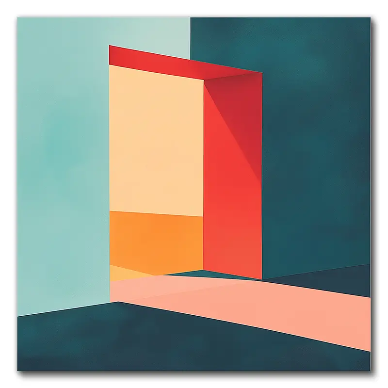
The Role of Color in Abstract Art

When you look at abstract art, you might find yourself pondering how colors can tap into your emotions in surprising ways.
It's fascinating to think that the bold reds and oranges might energize you, while the soothing blues and greens can usher in a sense of tranquility, almost like a warm hug from your favorite blanket.
As you explore the interplay of color combinations and their cultural meanings, you'll discover just how deeply these choices resonate not only with the artist's intent but also with your own individual experiences.
Emotional Resonance of Colors
While exploring the world of abstract art, you might notice how the emotional resonance of colors can greatly shape your experience. Color isn't just a visual element; it's a powerful language that speaks to your feelings. For instance, when you see vibrant reds and yellows, you might feel a surge of excitement and energy, as if the artwork itself is nudging you to dance (though you might want to check for onlookers first).
Conversely, the soothing blues and greens can wrap you in a blanket of calmness, inviting tranquility into your bustling mind.
Interestingly, the emotional impact of these colors can vary widely depending on cultural contexts. In Western societies, blue often conveys trustworthiness, while in some Asian cultures, it symbolizes immortality—talk about a color with depth!
Artists like Mark Rothko strategically use color fields to tap into our basic human emotions, proving that their choices aren't merely aesthetic but deeply intentional. Additionally, research indicates that these colors can even trigger physiological responses, such as increased heart rates with warm tones and a sense of relaxation with cooler shades.
Color Combinations and Impact
Exploring the interplay of color combinations reveals how they can dramatically influence your emotional experience in abstract art. When you investigate the world of colors, you'll discover that contrasting hues can create a sense of tension, while harmonious pairs often foster serenity and balance.
For instance, artists like Mark Rothko utilized expansive fields of color to evoke specific feelings, showing how placement and saturation matter.
Consider the effects of various color combinations:
- Complementary colors like blue and orange can energize you, sparking emotional engagement.
- Warm colors such as red and orange might provoke excitement or passion, making your heart race a bit.
- In contrast, cool colors like blue and green can instill calmness and introspection, perfect for a moment of reflection.
- Curiously, combinations like yellow and blue have been shown to enhance creativity, urging innovative thoughts to surface.
As you explore abstract art, remember that these color combinations aren't just for show; they've a real impact on your mood and cognitive performance, inviting you to engage more deeply with what's before you.
Cultural Interpretations in Art
Color plays a pivotal role in how abstract art is perceived across different cultures, with each hue carrying its own unique significance. When you gaze at a piece of abstract art, you might find yourself interpreting the colors through the lens of your cultural background. For example, red might ignite feelings of passion for you, while someone from an Asian culture could see it as a symbol of luck and prosperity. This fascinating interplay of meanings transforms how you connect with the artwork.
Historically, the use of color has evolved dramatically; during the Renaissance, muted palettes dominated, but the Fauvist movement later exploded onto the scene with vibrant colors designed to evoke emotional responses. Artists like Wassily Kandinsky believed colors possess spiritual properties, aligning specific hues with different emotions, which ultimately influences your perception.
Furthermore, the combinations of colors in abstract compositions can lead to diverse emotional impacts; bold contrasts may stir excitement—think of a roller coaster ride for your eyes—while harmonious palettes could encourage calmness and reflection, much like a gentle breeze on a sunny day.
Frequently Asked Questions
How Does Color Affect Mood in Art?
Color profoundly affects your mood in art. Warm hues energize you, while cool tones calm you. The emotional response often depends on your personal experiences and cultural background, shaping how you connect with each piece.
How Does Color Affect Your Mood Experiment?
When you experiment with colors, you'll notice how they influence your mood. Bright hues can uplift your spirits, while darker shades might bring you down. Pay attention to your feelings as colors surround you.
How Does Color Create Mood or Emotion in This Artwork?
Colors in artwork directly influence your emotions. Warm hues energize you, while cool tones calm you. You'll feel excitement with reds and oranges, but tranquility with blues and greens, shaping your overall experience with the art.
What Is the Psychology of Color in Painting?
The psychology of color in painting influences how you feel. Warm colors ignite passion and urgency, while cool tones relax you. Your emotional responses can vary based on personal experiences and cultural backgrounds.
Final Thoughts
In the intricate dance of colors that fills a canvas, you discover not just aesthetics but a profound influence on your emotions and thoughts. As you explore the domains of color psychology, you might find that a mere splash of blue could evoke tranquility, while a dash of red ignites passion. So, the next time you gaze at a piece of art, remember: it's not just paint; it's a symphony of feelings waiting to resonate within you. At VerVeLush, we understand the power of color in art, offering a curated selection of canvas prints that speak to your emotions and elevate your space. Explore our collection to find the perfect piece that harmonizes with your mood and transforms your environment.

 today and enjoy free shipping!")